Paradox of choice
Schwartz’s Paradox of Choice argues that more options don’t make us happier. They produce more deliberation, more regret about the rejected alternatives, and sometimes decision paralysis. Up to a point options increase satisfaction. Past that point they start to hurt.
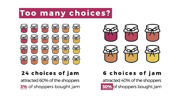
The supermarket-shelf studies that popularised the idea have a mixed replication record. The robust takeaway isn’t “fewer options always wins” but “options have a non-linear cost, and past a threshold they hurt rather than help”.
Where it shows up in CRO
Section titled “Where it shows up in CRO”- Pricing pages with too many tiers - 5+ tiers usually convert worse than 3. The brain can hold 3 options in parallel, struggles past that.
- Product category pages with no filtering - 200 SKUs presented flat overwhelm. Good filtering or smart default sorting recovers most of the lost conversion.
- Configuration flows with too many choices - “build your own” tools that ask 12 questions before showing a price are conversion killers in most categories.
- Checkout payment methods - more options technically helps conversion (matches more buyer preferences) but past a point adds visual clutter and decision delay. 4-6 well-chosen options usually wins over 12.
Where the conventional wisdom breaks down
Section titled “Where the conventional wisdom breaks down”The “more options = more conversion” intuition does hold in some places:
- Product variants (sizes, colours). More options usually win because the absence of the buyer’s preferred variant kills the sale.
- Filterable catalogues. Large catalogues with good filtering outperform small catalogues because the cognitive load of finding the right thing is solved by the filtering, not by reducing the catalogue.
- B2B where buyers are doing serious comparison work and expect comprehensiveness.
The principle isn’t “fewer is better”. It’s “the load of the choice matters as much as the number of options”. Three options badly presented can convert worse than ten well-presented ones.
How to design around it
Section titled “How to design around it”- Default to a recommended option. When pricing tiers have a “Most Popular” highlight, conversion improves on the highlighted tier because the default reduces decision load and lets System 1 take over.
- Reveal complexity progressively. Start with three primary options. If the visitor wants more, expand to show alternatives.
- Use filtering to subset large catalogues into manageable chunks so the visitor never faces all options at once.
- Pre-curate selections for visitors who don’t want to choose. Subscription boxes, “starter packs”, and bundled bestsellers all reduce the choice burden.