UX design and CRO
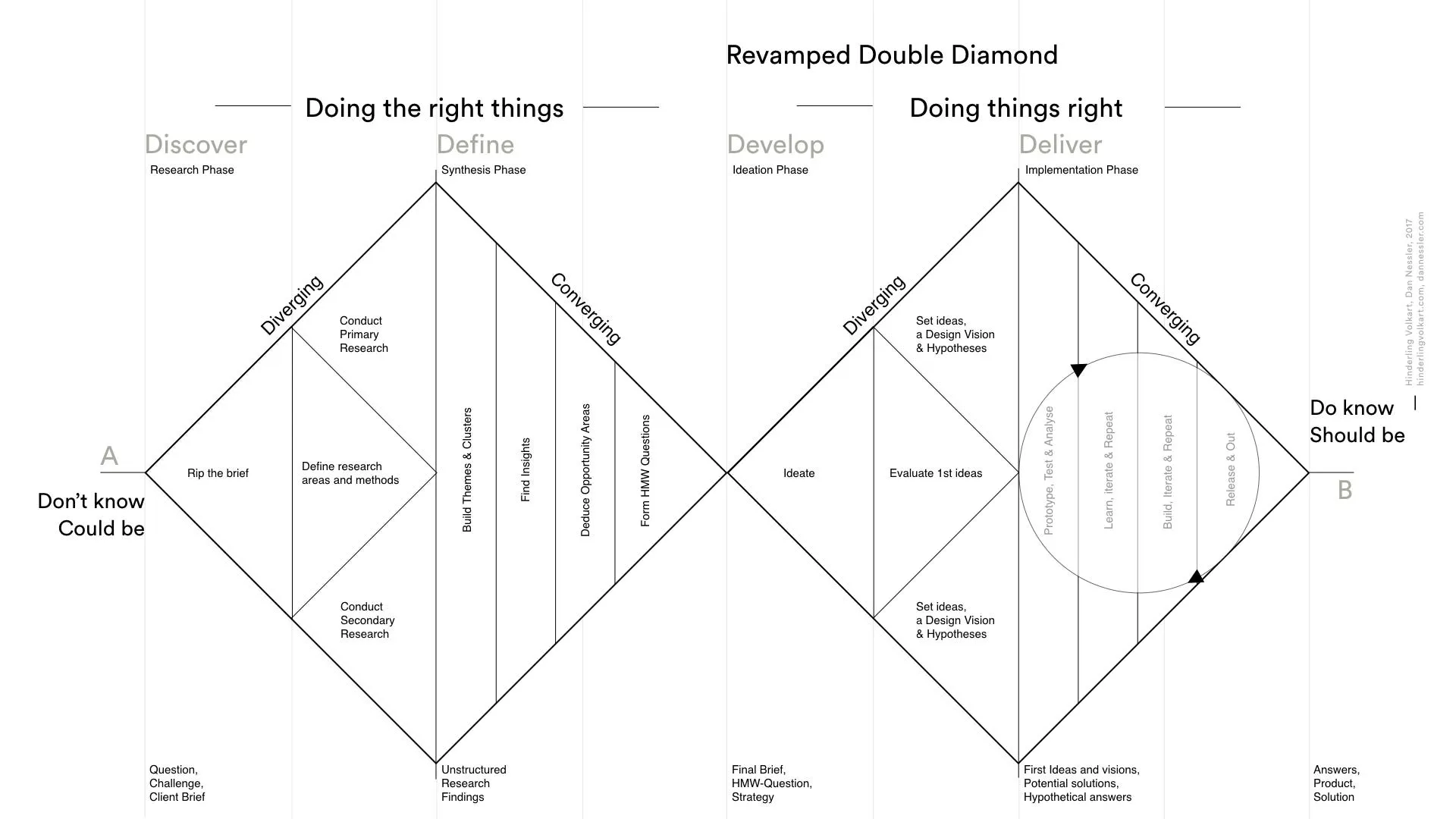
UX design and CRO overlap enough that people use the words interchangeably, and they optimise different things. UX optimises an experience. CRO optimises a decision. Those pull in the same direction often enough to be confusing and diverge often enough to matter.
The short version of my position: on an eCommerce site the highest-leverage UX work is nearly always subtractive, and on a SaaS product it’s constructive. Most of the disagreement between the two disciplines comes from people applying the second kind of thinking to the first kind of problem.
Storefronts vs products
Section titled “Storefronts vs products”Buying something online is one of the most heavily rehearsed interactions in modern life. Your visitor has used a thousand checkouts. They know where the basket icon lives, they know what a PDP looks like, they know that the price sits near the title and the reviews sit below the fold. They arrive with a complete mental model already installed.
Which means the interface is rarely the binding constraint. The offer is, or the price is, or the trust is, or there’s friction somewhere specific. Novel interface work on a conventional eCommerce surface mostly loses, because it makes the visitor think about the mechanism when they were previously thinking about the product.
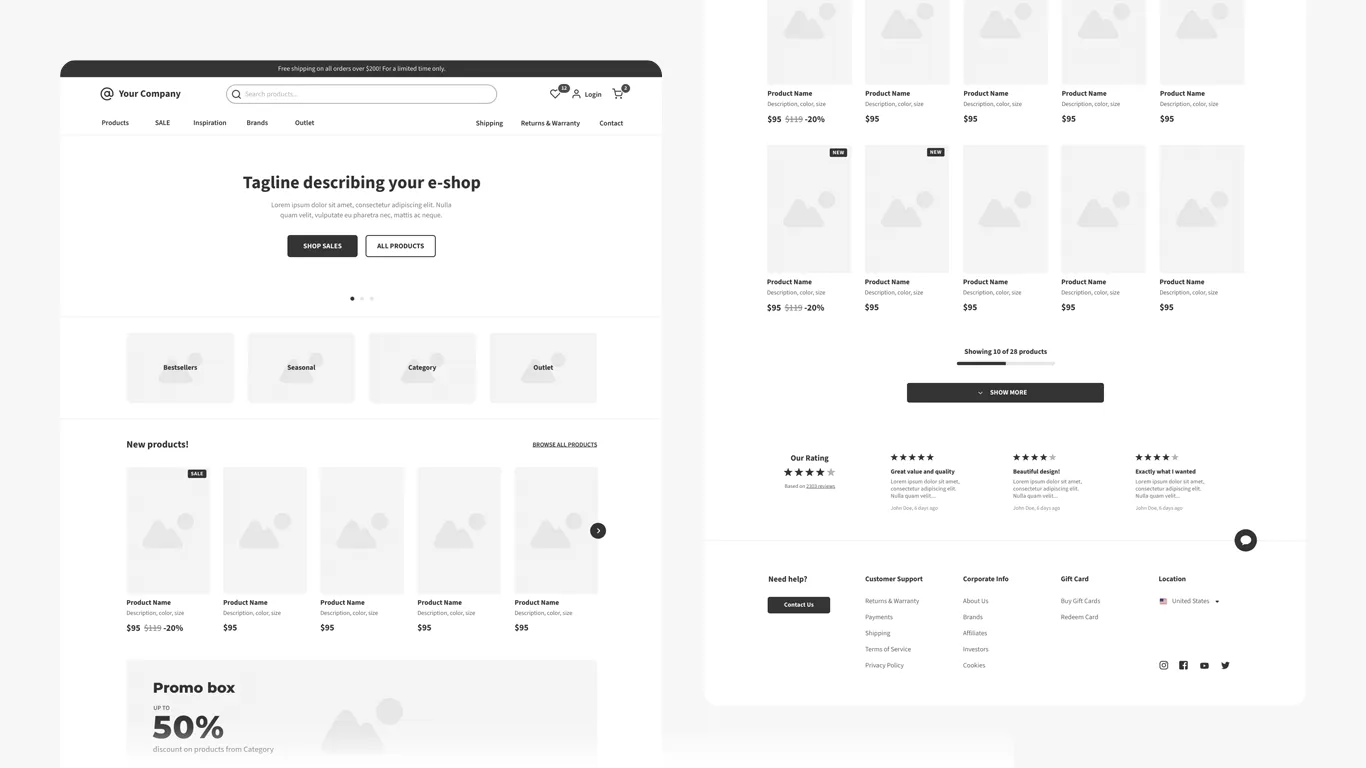
So the useful UX contribution on a storefront is removing things: fields, steps, decisions, load, anything that makes the visitor pause to work out what’s happening. It’s unglamorous and it’s most of the available win.
SaaS is the opposite case. There’s no shared mental model for your product because your product is the only one of it. The experience is the thing being sold, conversion happens inside the product rather than on the marketing site, and getting a new user to the point the thing becomes useful is a design problem in the full sense. Onboarding, empty states, defaults, the first-run sequence - that’s where craft has room, and where a genuinely good designer moves numbers a copy test never will.
Most UX is written for someone else
Section titled “Most UX is written for someone else”The other reason the disciplines talk past each other is that most published UX practice is written by and for companies that have a research function, a design system, dedicated researchers, and a quarterly release cadence.
Real client work rarely has any of that. You have weeks, not quarters. There’s no researcher, there’s you. The site ships this month because there’s a campaign behind it. A process that assumes six weeks of discovery before anyone draws anything isn’t wrong, it’s just describing a different job.
What survives the compression, in rough order of value per hour:
- A heuristic walk-through done properly, on the actual device, by someone who hasn’t seen the site before. Half a day.
- Five-user usability testing. The five-user rule exists precisely because the marginal return collapses fast. Enough to find the show-stoppers.
- Session recordings, watched in a batch of twenty on one flow, not dipped into at random.
- A friction log written live during a real purchase.
What doesn’t survive, and I’d skip without guilt on most engagements: diary studies, extended persona development, full journey-mapping workshops, card sorting for a twelve-page site. They’re real methods that pay off at a scale most clients aren’t operating at.
What actually transfers
Section titled “What actually transfers”The parts of UX worth internalising for conversion work are mostly the cognitive ones rather than the process ones.
Cognitive load and processing fluency explains most of what a heuristic review finds, and explains it better than a heuristics list does. Mental models tells you when convention is load-bearing and when it’s just habit. Friction analysis is the operational version of both.
Accessibility deserves more attention than it gets in CRO specifically, and not for compliance reasons. Sufficient contrast, sensible tap targets, labelled form fields, a page that works at 200% zoom and doesn’t fall apart under a screen reader - every one of those is also a conversion improvement for people who aren’t disabled at all. Anyone on a phone in bright sunlight is temporarily low-vision. The overlap between accessible and easy is large enough that treating them as separate budgets is a mistake.
Where I land
Section titled “Where I land”I’d rather work with a designer who understands the offer than one with an immaculate design system, on an eCommerce project. On a SaaS product I’d take the opposite. The discipline that matters is the one closest to where the decision is actually made, and on a storefront that’s almost never the interface.
The honest tension is that this reads as dismissive of UX, and it isn’t meant to. The craft is real. It’s that the conventional storefront has already had a decade of collective UX applied to it by everyone else, so the remaining upside sits in the offer, the proof and the friction rather than in the layout.